Calligraphy for Beginners: Step by Step
Nov 7, 2026 · The Editors
Calligraphy for beginners, step by step: the three kinds of pen, the one principle behind every script, holding the pen, your first drills, paper and ink, which alphabet to start with, and how to practise.
Calligraphy is beautiful writing — and it is far more learnable than it looks. Every elegant script rests on one simple principle and a lot of patient repetition.
The one principle
Thick downstrokes, thin upstrokes.
Whatever the pen, the contrast between heavy and light strokes is what makes writing look like calligraphy. Everything else is practice.
Three kinds of pen
1. Broad-edge (italic) pens. A nib with a flat, chisel-shaped tip. The thick and thin lines come from the angle: pull the nib sideways for a thin line, downwards for a thick one. Used for italic, gothic (blackletter) and uncial scripts. Easiest to learn first.
2. Pointed pens. A flexible, sharp nib. The thick and thin lines come from pressure: press on the downstroke and the nib's halves spread for a thick line; lighten for a hairline. Used for copperplate and Spencerian scripts — the flowing wedding-invitation styles.
3. Brush pens. A felt or bristle tip with a built-in ink supply. Pressure gives the thick and thin. The quickest route to "modern calligraphy", the loose, bouncy lettering on cards and signs.
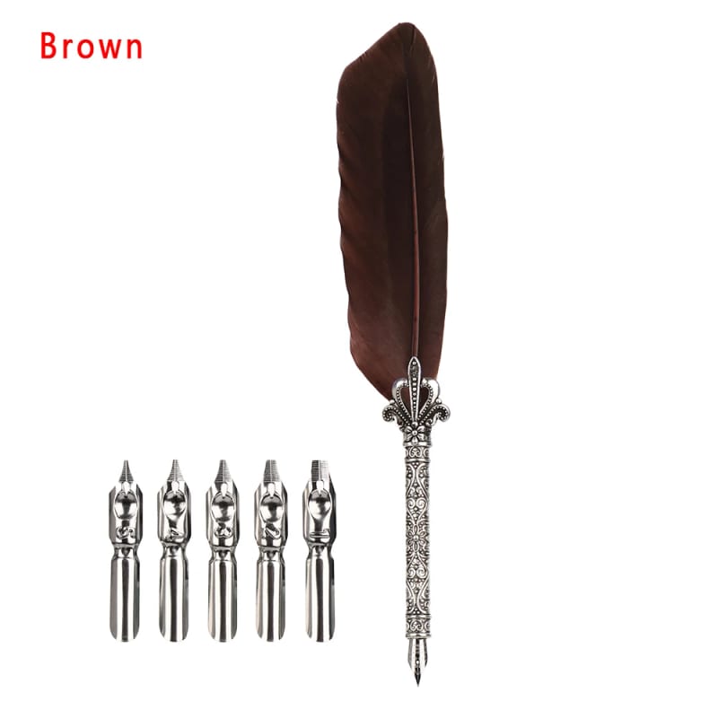
A dip pen or quill with steel nibs can be used for broad-edge or pointed work, depending on the nib. How to write with a quill pen.
Holding the pen
- Hold it lightly, further back than an ordinary pen.
- For broad-edge writing, keep the nib at a constant angle to the line — about 30 to 45 degrees for italic. Don't let it rotate as you write.
- For pointed pen, the nib points along the slant of the letters, often with the paper turned.
- Move from the arm and shoulder, not just the fingers. Calligraphy is closer to drawing than to handwriting.
Your first drills
Before letters, practise strokes:
- Straight downstrokes — rows of parallel lines at the same slant.
- Upstrokes — light, thin diagonal lines.
- Ovals — round shapes, thick on the down side.
- Under-turns and over-turns — the "u" and "n" shapes.
These four shapes build almost every lowercase letter. Ten minutes of drills before each session pays off fast.
Paper and ink
- Paper: smooth and heavy enough not to bleed — calligraphy pads, layout paper or smooth laser paper. Printer paper feathers.
- Ink: sumi or India ink for black; walnut ink for brown, antique-looking work. Thin fountain-pen ink runs too fast for most dip nibs.
- Guidelines: draw or print lines for the baseline, x-height and slant, and put them under your page. Even letters come from even guides.
Which alphabet first?
- Italic with a broad-edge pen — clear, forgiving and easy to read.
- Modern brush lettering for quick results.
- Leave copperplate until your hand is steady: it demands precise pressure.
How to practise
- Short and often — twenty minutes a day beats two hours on Sunday.
- Slowly. Calligraphy is slow writing by definition.
- One letter at a time, then common pairs, then words.
- Keep your first pages — in a month, the difference will astonish you.
Calligraphy for beginners — a first project
Address a few envelopes, write a quote for a frame, or write out the names for a dinner table. Projects keep practice from feeling like homework.
Mentioned above